2019: Dark Mode Arrives and Email Designers Panic
In September 2019, Apple released iOS 13, and email designers around the world collectively groaned. The update included a system-wide dark mode that inverted the color scheme of every app — including Apple Mail. Overnight, billions of carefully designed HTML emails went from looking polished on white backgrounds to looking like abstract art experiments gone wrong.
The Problem Nobody Saw Coming
Email design has always been an exercise in compromise. HTML emails don’t render like web pages — email clients use stripped-down rendering engines with inconsistent CSS support, and designers have spent decades learning the quirks of Outlook, Gmail, Apple Mail, and dozens of other clients. But through all of that, one thing was constant: the background was white (or light). Every logo, every color choice, every design decision assumed a light canvas.
Dark mode obliterated that assumption.
A white logo on a transparent background? Invisible against a dark background. Black text? Automatically inverted to white, which was fine until the email included a white background section, turning the text invisible there instead. Colored buttons designed to pop against white? Muddy and indistinguishable against charcoal gray. Brand colors carefully calibrated for one context suddenly clashed in another.
Three Flavors of Chaos
Making the problem worse, different email clients implemented dark mode differently. The industry quickly identified three distinct approaches:
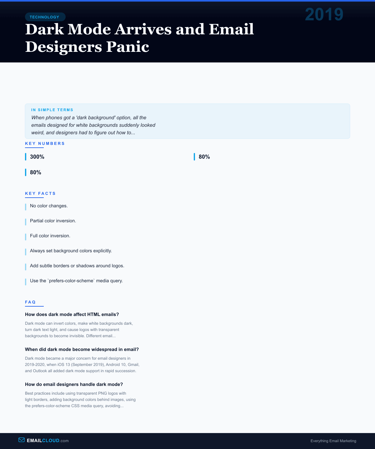
No color changes. Some clients, including certain versions of Gmail, simply placed the email in a dark-themed UI without modifying the email’s own colors. The email looked like a white card floating in a dark interface. Not ideal, but at least the email itself was intact.
Partial color inversion. Apple Mail and some versions of Outlook selectively adjusted colors. Light backgrounds were darkened. Dark text was lightened. But the algorithm wasn’t always smart about it — sometimes it inverted colors that shouldn’t have been inverted, creating ugly results.
Full color inversion. Some clients inverted everything, including images. This was the nuclear option, and it could make emails completely unreadable. A blue button might become orange. A carefully chosen brand red might turn teal.
For designers accustomed to the painful but at least stable inconsistencies of email clients, dark mode introduced a whole new dimension of unpredictability. An email could now render differently not just across clients, but within the same client depending on a user setting.
The Industry Scrambles
The response from the email design community was swift and slightly panicked. Within months of iOS 13’s release, blog posts, webinars, and conference talks about dark mode design flooded the industry. Litmus, Email on Acid, and other testing platforms rushed to add dark mode preview capabilities. The Litmus community reported that dark mode-related queries jumped 300% in the month after iOS 13’s release.
Several best practices emerged from the chaos:
Always set background colors explicitly. Never rely on defaults. If you want a white section, declare background-color: #ffffff rather than assuming the default will be white. Some dark mode implementations only invert default-colored elements, leaving explicitly declared colors alone.
Add subtle borders or shadows around logos. A white logo on a transparent PNG becomes invisible in dark mode. Adding a thin stroke, a slight drop shadow, or a non-transparent background gives the logo something to anchor against.
Use the prefers-color-scheme media query. This CSS feature, originally designed for websites, works in some email clients (notably Apple Mail and some webmail clients). It allows designers to specify alternate styles for dark mode — different colors, different images, different layouts.
Avoid pure black (#000000) and pure white (#ffffff). These extremes get inverted aggressively. Slightly off-black and off-white colors are less likely to be targeted by dark mode algorithms.
Test. Then test again. With dark mode, the testing matrix expanded significantly. An email needed to be checked in every major client, in both light and dark modes, on both mobile and desktop. The number of test combinations roughly doubled overnight.
The Adoption Numbers
Dark mode wasn’t a niche feature. Adoption was rapid and broad. By 2020, surveys showed that 65-80% of smartphone users had enabled dark mode system-wide. Among email-heavy demographics — knowledge workers, tech-savvy consumers — adoption was even higher.
Android 10 added system-wide dark mode in September 2019, the same month as iOS 13. Gmail rolled out dark mode for its mobile apps in late 2019 and added it to its web interface in 2020. Outlook added dark mode across its platforms. By the end of 2020, virtually every major email client offered dark mode, and a substantial portion of users had it enabled.
This meant that email designers could no longer treat dark mode as an edge case. When 50-80% of your audience might be viewing your email in dark mode, it’s not a secondary consideration — it’s a primary design requirement.
The Lasting Impact
Dark mode didn’t just add a design constraint — it accelerated a broader shift in how the email industry thinks about rendering. The concept of “defensive design” — building emails that degrade gracefully across unpredictable environments — became paramount. Designers who had been writing email HTML the same way for a decade had to relearn their craft.
The episode also highlighted a fundamental tension in email: designers want pixel-perfect control, but email clients have always reserved the right to modify how messages display. Dark mode was just the most dramatic example. Email clients strip styles, rewrite CSS, resize images, block fonts, and add their own formatting. The email in your recipient’s inbox is never exactly what you designed — dark mode just made that reality impossible to ignore.
Today, designing for dark mode is a standard part of email production, as routine as testing for Outlook’s quirks or optimizing for mobile. The panic of 2019 gave way to established practices, updated tooling, and acceptance that email design now requires thinking in two color modes simultaneously. It’s one more constraint in a discipline that was already defined by constraints.
Infographic
Share this visual summary. Right-click to save.
Related Events
Frequently Asked Questions
How does dark mode affect HTML emails?
Dark mode can invert colors, make white backgrounds dark, turn dark text light, and cause logos with transparent backgrounds to become invisible. Different email clients handle dark mode differently, making consistent rendering a significant challenge.
When did dark mode become widespread in email?
Dark mode became a major concern for email designers in 2019-2020, when iOS 13 (September 2019), Android 10, Gmail, and Outlook all added dark mode support in rapid succession.
How do email designers handle dark mode?
Best practices include using transparent PNG logos with light borders, adding background colors behind images, using the prefers-color-scheme CSS media query, avoiding pure black and pure white, and testing in multiple clients.